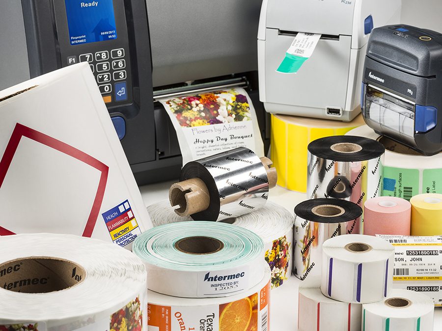
As companies look for ways to create more customized and branded packaging, color label printing has grown in importance. Use of color has also extended to barcode printing – designers want their packaging to make a visual impact, without having to accommodate a strictly black and white barcode on the box.
However, color barcodes come with caveats – if you use the wrong color combination, the code will be difficult (or impossible) to scan. When choosing colors for your barcode labels, you have to take the barcode scanner into consideration, along with barcode spacing and contrast. Some scanners, like Honeywell’s Xenon 1900 Color area-imaging scanner, utilize ColorFusion Technology which allows color images to be captured, even at high contrast, without sacrificing performance. However, many general purpose scanners lack the technology required to get a good read, so you’ll need to ensure that you are designing color barcode labels to overcome the challenges of contrast and color combination.
Contrast is critical. If there isn’t enough contrast between the bar code and background, most scanners will have a difficult time reading the barcode. Those failed scans can cause costly problems down the road.
Laser barcode scanners use a light source that operates in the red portion of the color spectrum. Because of this, these scanners have difficulty with the colors red and yellow (red essentially shows as “white” to these scanners). Laser scanners will have an easier time reading barcodes that are printed in dark colors with a high contrast compared to the background color. The lower the contrast, the harder it is to scan the code.
This is why most barcodes are printed in black and white; that combination provides the highest level of contrast. For companies that want to add more color to their packaging, there are a few simple rules to follow when selecting a color combination for barcode labeling.
Selecting a Readable Color Barcode Combination
Make sure you select colors that are compatible with the barcode scanners you are using, and always keep contrast in mind.
Examples of Good Color Combinations: The best combinations for barcodes include bars that are dark blue, dark green, dark brown, or black, and backgrounds that are white, or in the yellow or red spectrum. Remember, laser scanners identify red as white, providing a colorful background option that won’t affect contrast.
Examples of Bad Color Combinations: Poorly designed color barcodes include bars that are white or in the red or yellow spectrum, or backgrounds that are too dark, or in the blue or black part of the spectrum.
There are other factors to consider as well. When designing your barcode, do so with CMYK and reference a color management system (CMS) to assure a quality reproduction of the desired color for the labels. In addition, avoid labeling materials that are reflective. Even a slight reflection on the label can affect contrast, so make sure you select labels and overlays that won’t cause scanning issues.
And make sure there are a few millimeters of space around the entire code (sometimes referred to as a light zone or quiet zone) to help ensure reliable scanning. This area should be free of text, marks, or other printed items. The quite zone should be a minimum of 10 times the width of the narrowest bar of a linear barcode, or one cell width on each of the symbols for 2D barcodes. The quite zone allows the scanner to see the entire code.
Make sure you test the barcode label with different scanners to make sure it will be readable both in your own facility and for downstream supply chain partners. As long as you follow the basic contrast rules (dark colors for the bars, light colors or red for the background) you should be able to produce an attractive and readable color barcode.


Recent Comments